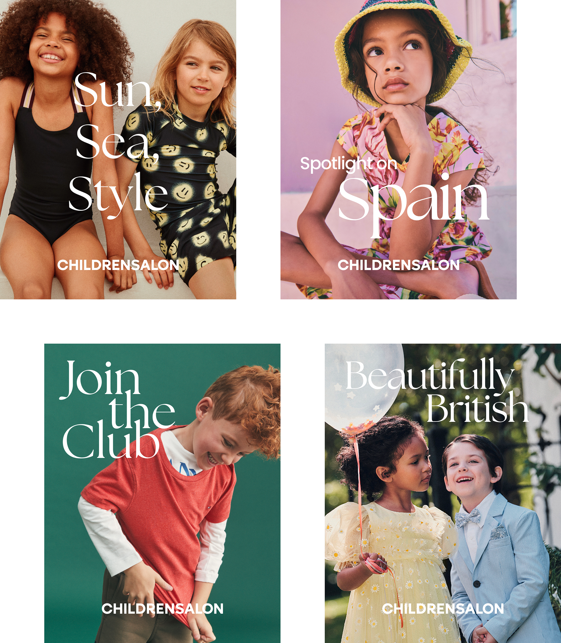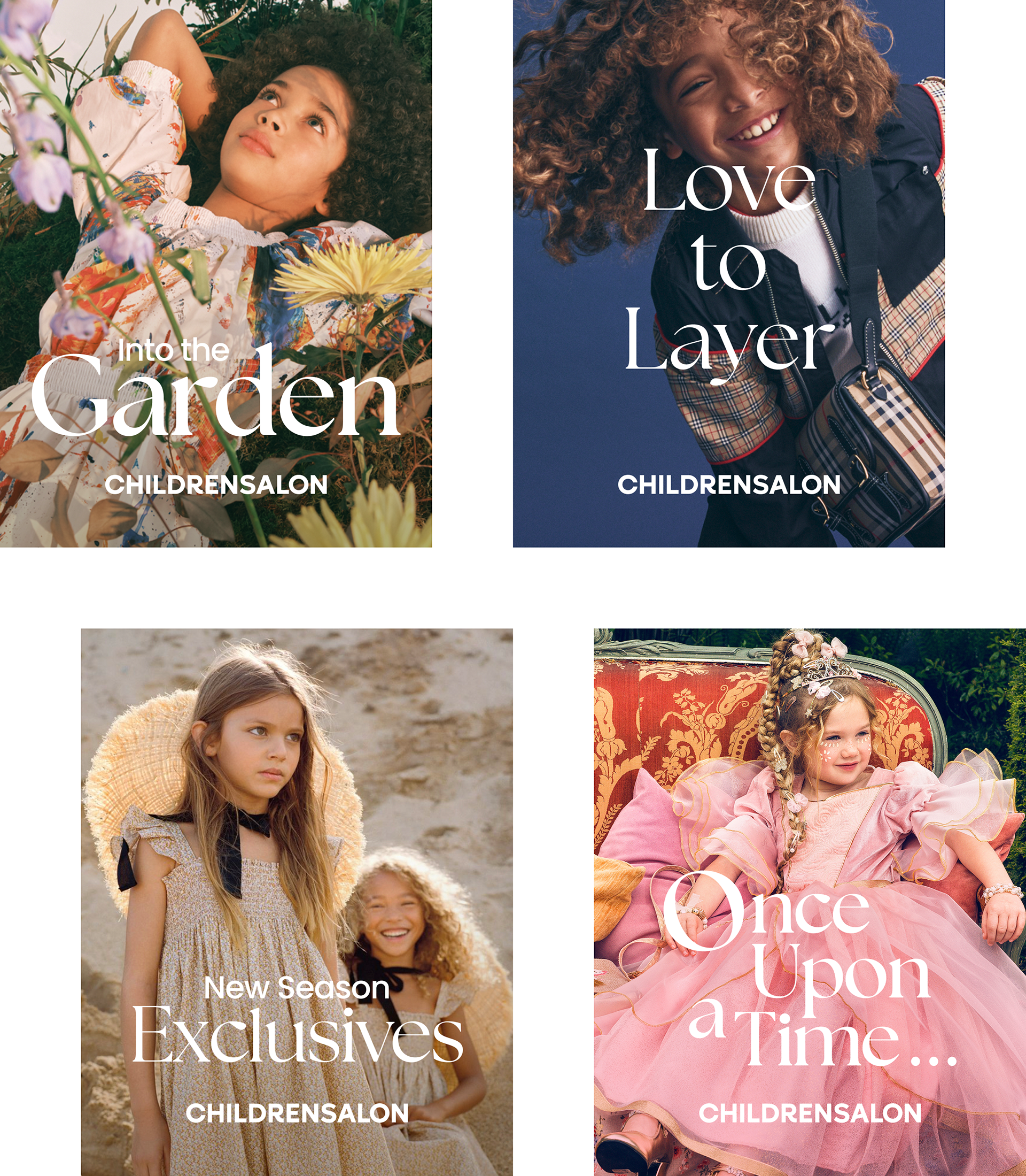
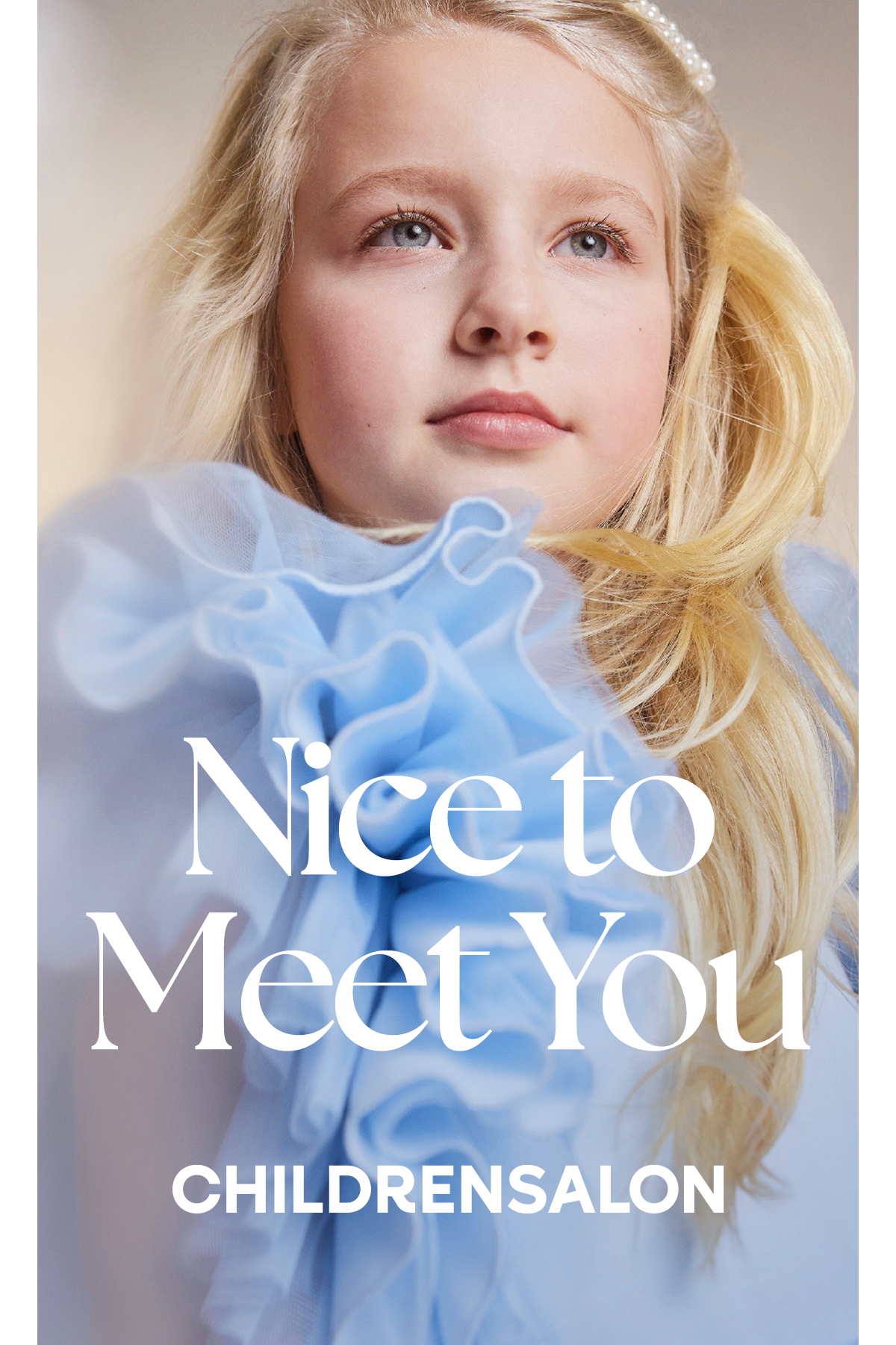
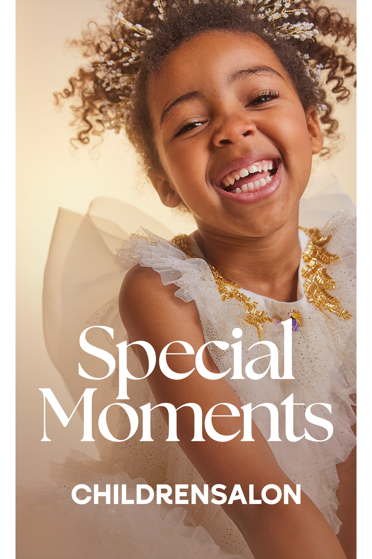
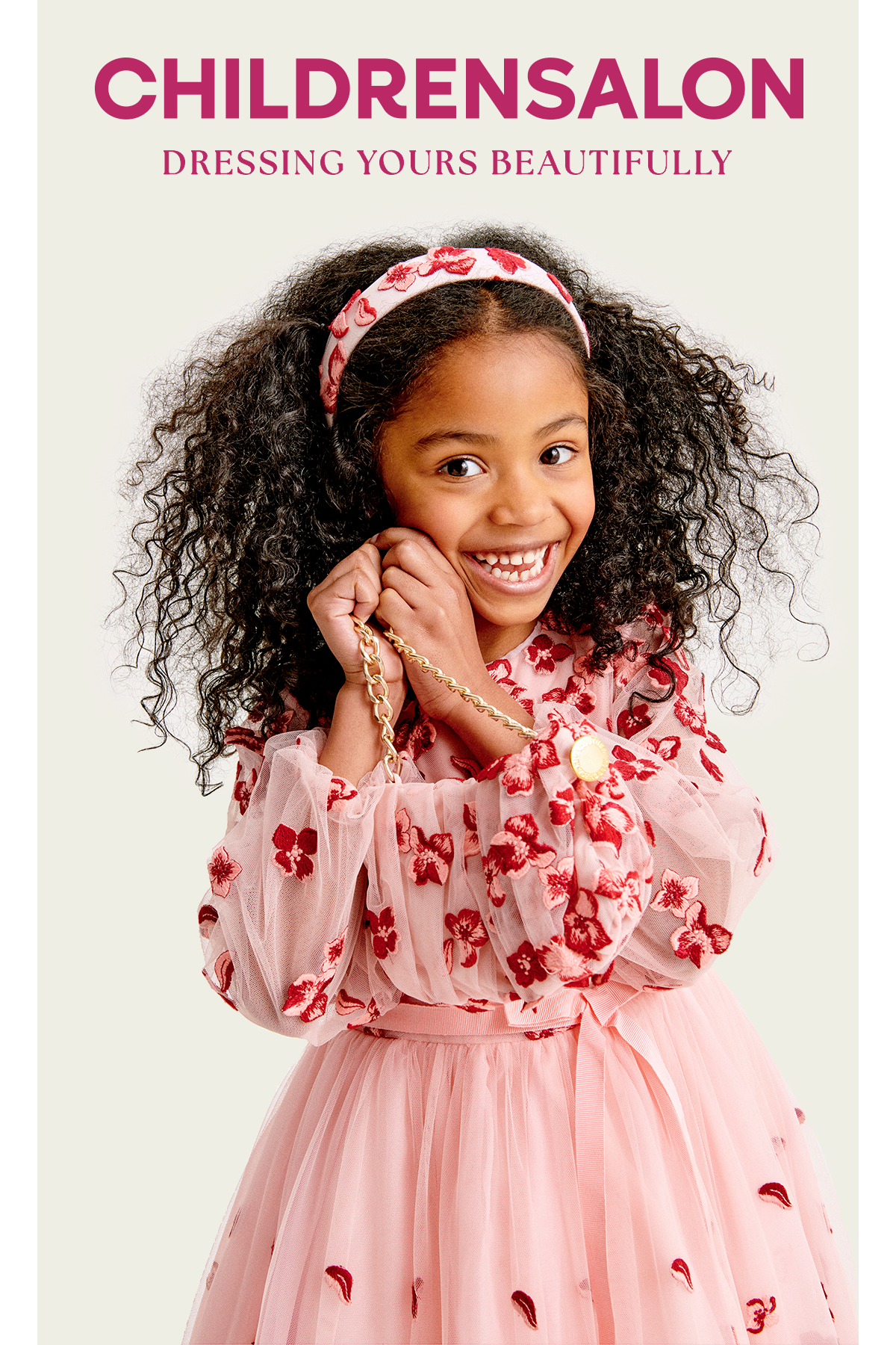
An elegant brand refresh for a Children's
Designer Clothing Retailer, with a strong
focus on luxury, heritage and family.
Designer Clothing Retailer, with a strong
focus on luxury, heritage and family.

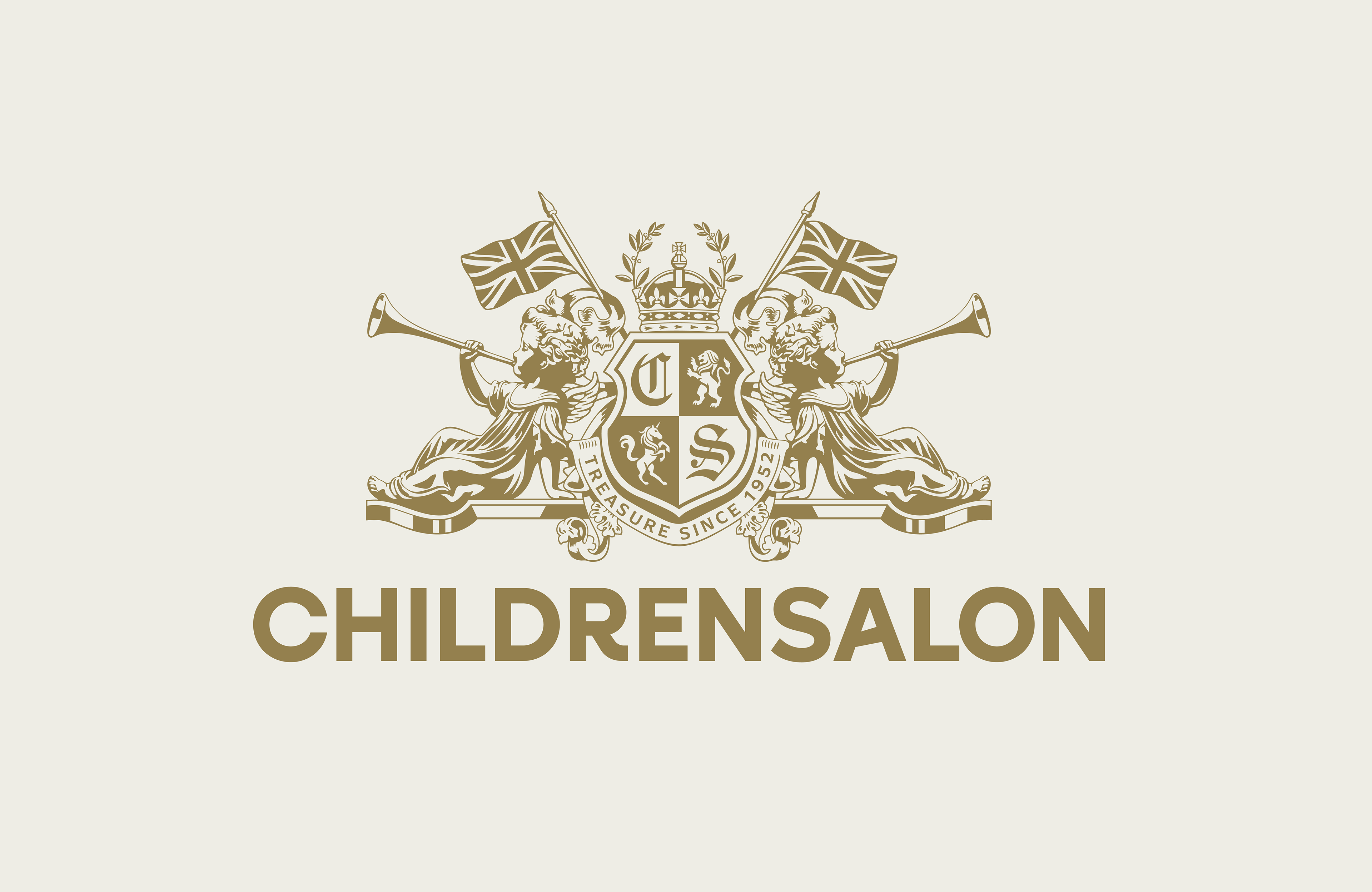
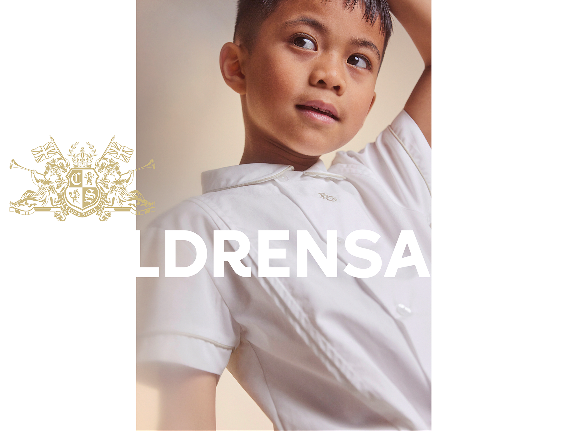
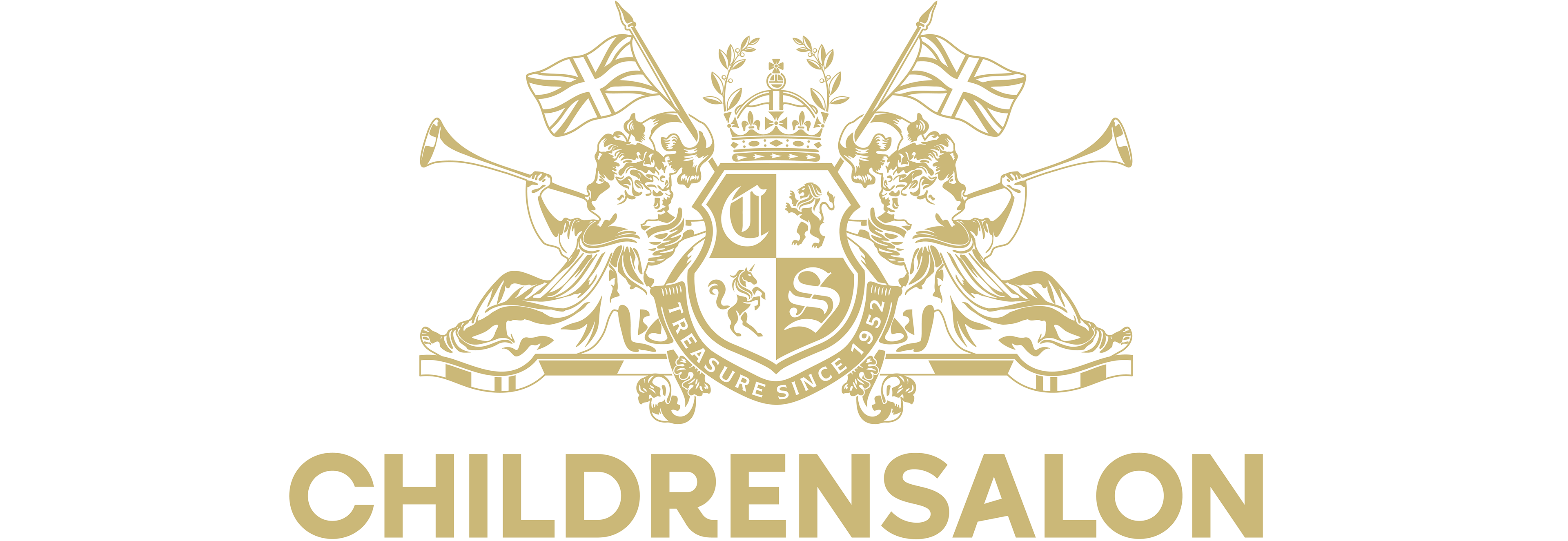
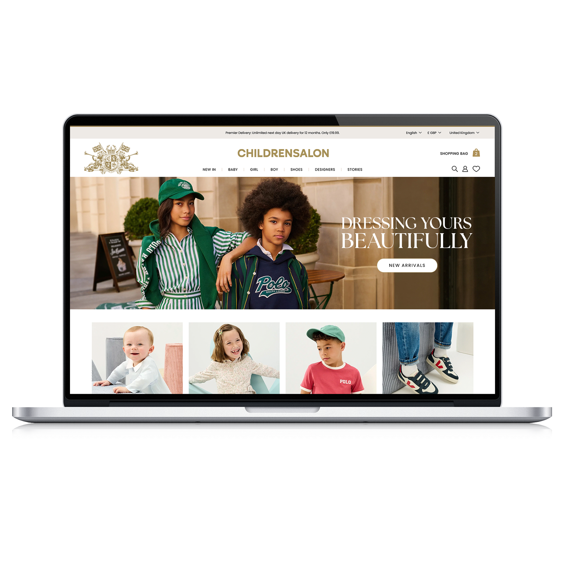
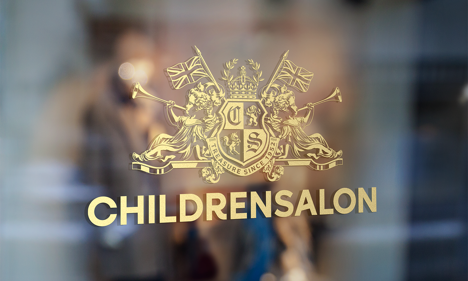
The crest logomark was redrawn as a larger single colour illustration to improve legibility and create a more premium, confident impression with customers. This better reflects the brand and brings it in line with modern digital requirements.


The wordmark has also been updated to better reflect the brand. A premium but youthful sans serif with playful customisations reflects the visual language from the crest. The descender of the R mirrors the sitting cherub and A runs parallel with the horn.


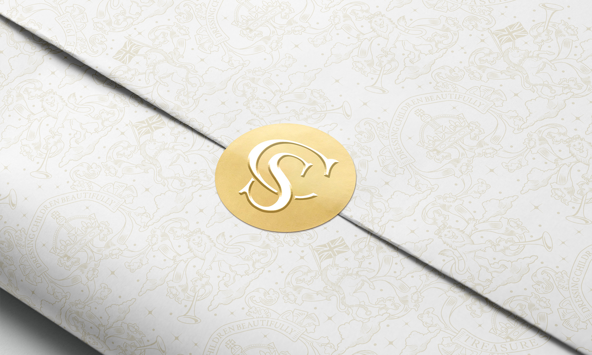
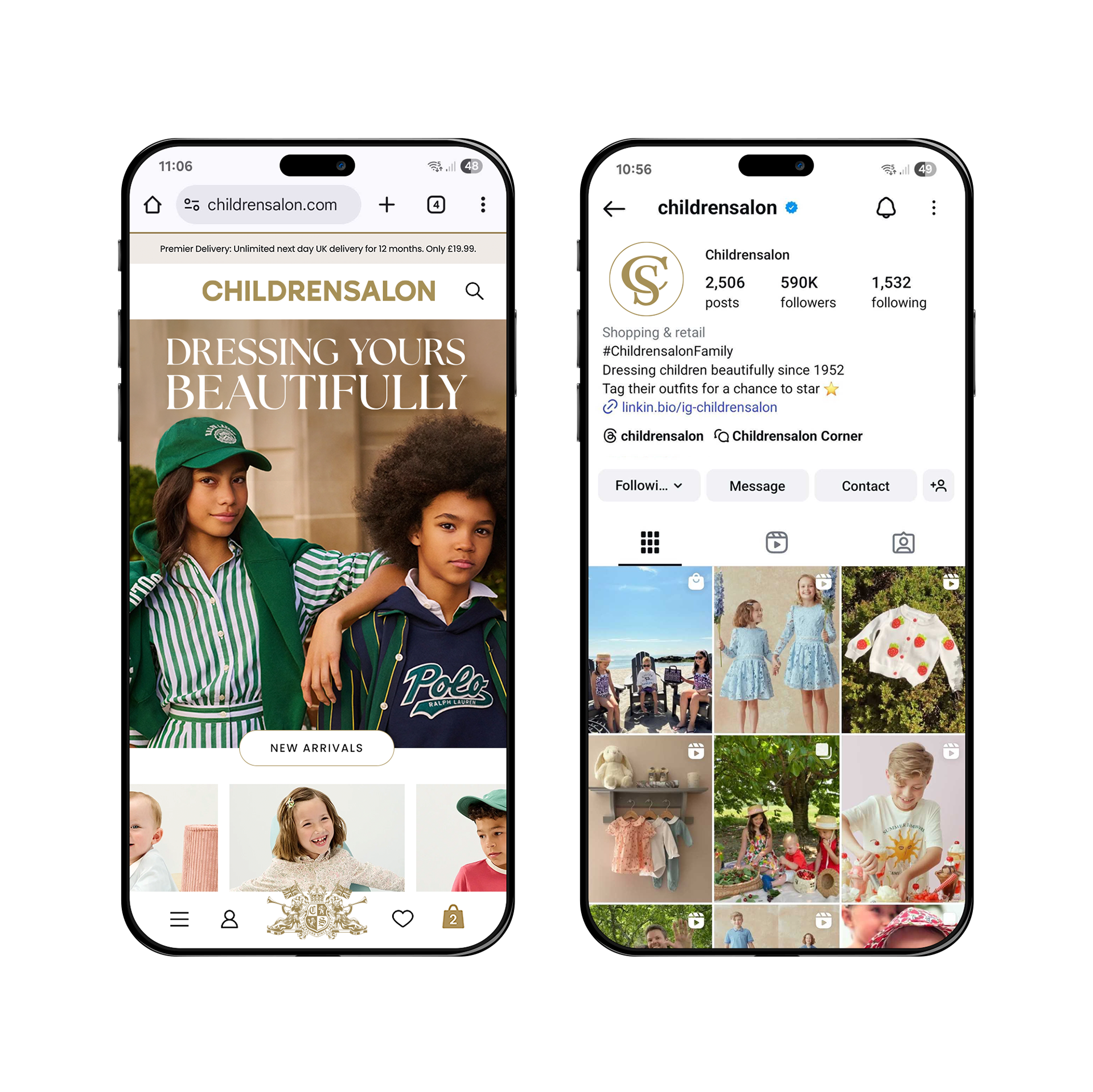
Scalability is also an important aspect of the brand refresh. A monogram was developed as part of the asset library. It was created to be used at smaller sizes, as well as on social media and as a stamp when the design calls for some visual variety.
An inverted version of the crest was created to be used on darker backgrounds. This version was carefully considered to avoid creating a negative effect with he cherubs and retain the impact of the design.